DON’T LOOK NOW (1973)
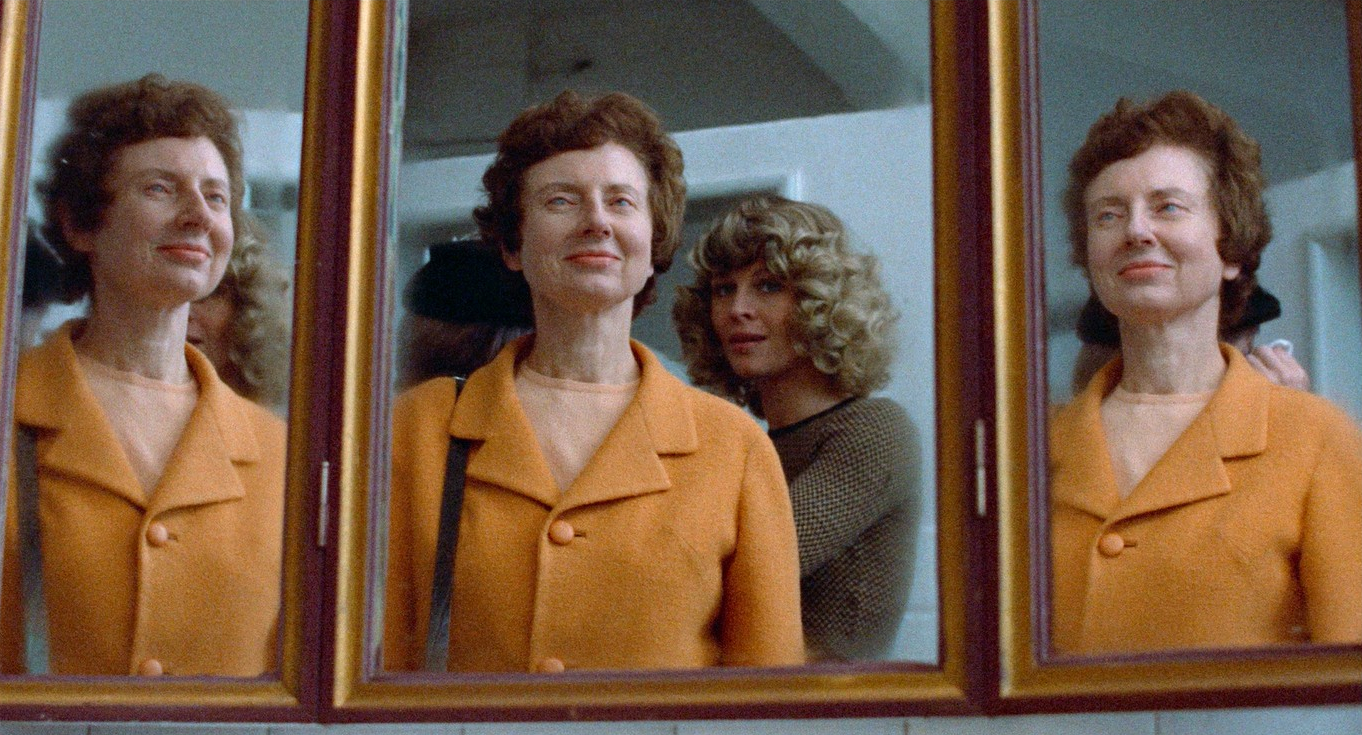
A married couple grieving the recent death of their young daughter are in Venice when they encounter two elderly sisters, one of whom is psychic and brings a warning from beyond...
A married couple grieving the recent death of their young daughter are in Venice when they encounter two elderly sisters, one of whom is psychic and brings a warning from beyond...

The early 1970s was a beautiful and traumatic time for cinema. The density of really interesting films seems higher than at any other time since. Being a child of the 1960s, there were two films I remember watching on television that really shook me up, stirred my senses, played with my little mind, and left a lifelong impression. They were unlike anything I’d seen before and both had unexpected endings that shocked me to the core.
The first was Robin Hardy’s The Wicker Man and the second was Nicolas Roeg’s Don’t Look Now, both made in 1973 and originally released together as a double feature! Don’t Look Now is distinguished by being an intriguing supernatural mystery bracketed between the most harrowing, intensely affecting opening sequence, and one of the most nightmarish finales. Anyone who’s watched the film won’t need me to remind them because these scenes can never be unseen!
The ’70s was a decade of social and economic flux and the movie industry itself was going through upheaval. The proliferation of television changed people’s viewing habits and impacted the box office. Epic budgets became a thing of the past and getting a film into production was increasingly problematic. Although the future of cinema seemed under threat, the knock-on effects also stimulated the medium to diversify and try to redefine itself. International co-productions became commonplace and, with smaller budgets and tighter schedules, filmmakers were forced to become more inventive.
Stylistic experimentation was further encouraged by a couple of technical innovations. The increasing availability of colour-negative film made filming in colour much easier and cheaper by doing away with the older technique that required combining three, or sometimes four, negatives. That’s one for each primary colour and sometimes another for contrast. Also, the smaller Arriflex cameras liberated cinematography and made it possible to get some difficult camera angles with greater freedom of movement, especially on location.
Although Nicolas Roeg was used to working on those big-budget epics, having photographed Lawrence of Arabia (1962) and Doctor Zhivago (1965) for David Lean, he’d also learnt a thing or two while working with Roger Corman on The Masque of the Red Death (1964). Perhaps it was his experience with Corman that led him to readily embrace the deliberate language of colour and inventive camerawork showcased in Don’t Look Now. That and seeing Stanley Kubrick’s A Clockwork Orange (1971) demonstrate what could be achieved with the small Arriflex 2C 35mm camera, also used extensively by Roeg’s favourite cinematographer, Anthony Richmond, for the tight angles and dizzying hand-held sequences.
The film is based on the 1971 short story from the collection Not After Midnight by Daphne Du Maurier, the author who’d already provided source material for several classic movies—the best-known being Alfred Hitchcock’s Rebecca (1940) and The Birds (1963). Although faithful to the central plot and core theme, things changed dramatically in the transition from page to screen.
The well-to-do but sad couple in Du Maurier’s original story are dealing with grief over the loss of their child. In that version, their daughter has died of meningitis prior to the start of the story. For the film, screenwriter Allan Scott decided to include the child’s death but developed this element into something entirely different. This was probably rewritten simply to add visual impact and exploit its dramatic potential, but it also ramps up the parental guilt and injects an underlying unease and conflict between and within each of them.
The death of the daughter, this time by accidental drowning, is a montage masterclass and a truly traumatising piece of cinema. It’s difficult viewing for anyone and overwhelming for any parent. The way in which John Baxter (Donald Sutherland) ‘sees’ the impending tragedy building, almost as if he’s outside the reality of the film and watching it with us, suggests he has some psychic power straight off the bat. This is held back as a late reveal in the original story but here it’s as if Baxter has an insight into the director’s foreshadowing. When we start to understand this, our approach to the film is altered and it becomes less of a personal drama and more of a mystery thriller with supernatural clues. The viewer is sucked into dialogue with the work and invited to interrogate it scene by scene on both an intellectual and emotional level.
Roeg stated that the film is driven by theme over plot and, striving for that emotional truth and continuity, he decided to make the film in the same chronological order as the script. The famously gruelling opening sequence, which could almost be considered an eight-minute standalone short, was shot on location in Hertfordshire, England, during the winter of 1972, and sets up all the themes that will play out narratively and visually. Even the odd-looking house, with its clash of architecture lends meaning and informs the way the architecture of Venice is asymmetrically framed later on. Production then broke for Christmas, creating the necessary disjoint for John and his grieving wife, Laura (Julie Christie). In the New Year, filming continued abroad as a ten-week location shoot that beautifully exploits the crumbling grandeur of Venice.
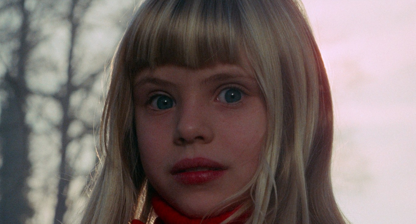
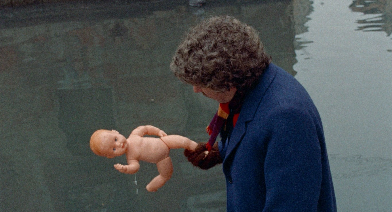
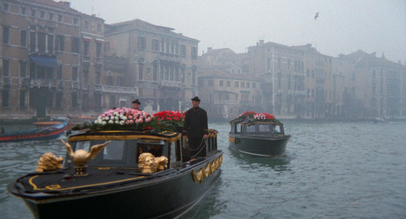
The thread of premonition, or ‘second sight’, runs through the entire film, from John’s first glimpse of a diminutive red-clad figure in a photograph that seems to foreshadow the daughter’s drowning, to the disorientating vision of his own funeral barge. Particularly in thrillers with a supernatural bent, there are motifs that hint or suggest solutions to the enigmas they contain. Those motifs can be explicit symbols, colours, sometimes even repeated actions or lines of dialogue. They help set up a rhythm to a narrative and either prepare us for the outcome or are strategically placed red herrings—a sort of conjurer’s misdirection to keep us off the track of a twist ending.
The prominent motifs in Don’t Look Now are water, the colour red, and translucent barriers… but what makes it unusual is that the characters are also privy to this foreshadowing. Like any good thriller, it throws in plenty of clues but keeps them ambiguous. For the plot to hold the viewer’s attention it relies on enigma and misinterpretation. The true meanings only fall into place as we approach the denouement.
Although perfectly cast, Sutherland and Christie were initially unavailable, and Natalie Wood and Robert Wagner were suggested instead. Roeg didn’t take this suggestion seriously and never considered anyone else for the lead roles. Luckily, both stars loved the script and were freed-up from their other commitments just in time and turn in what would be career-defining performances.

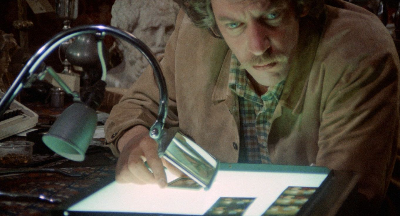
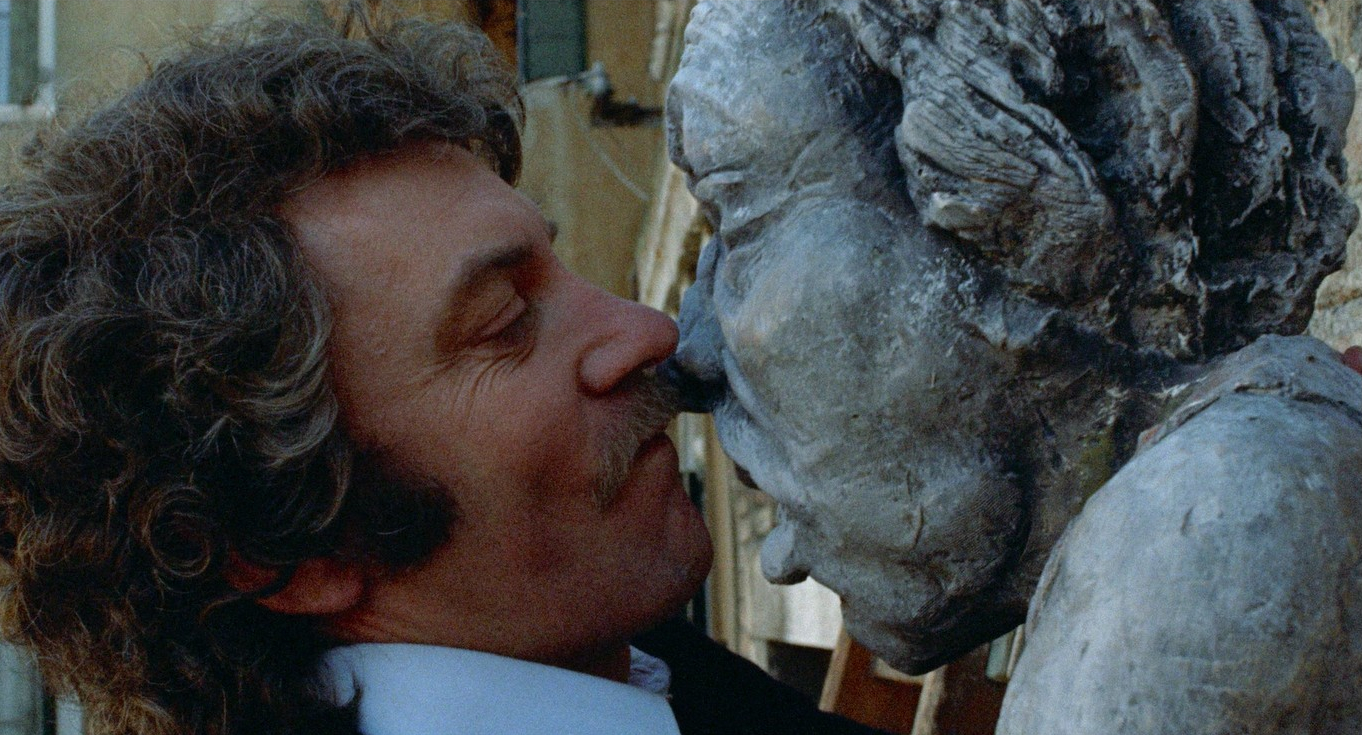
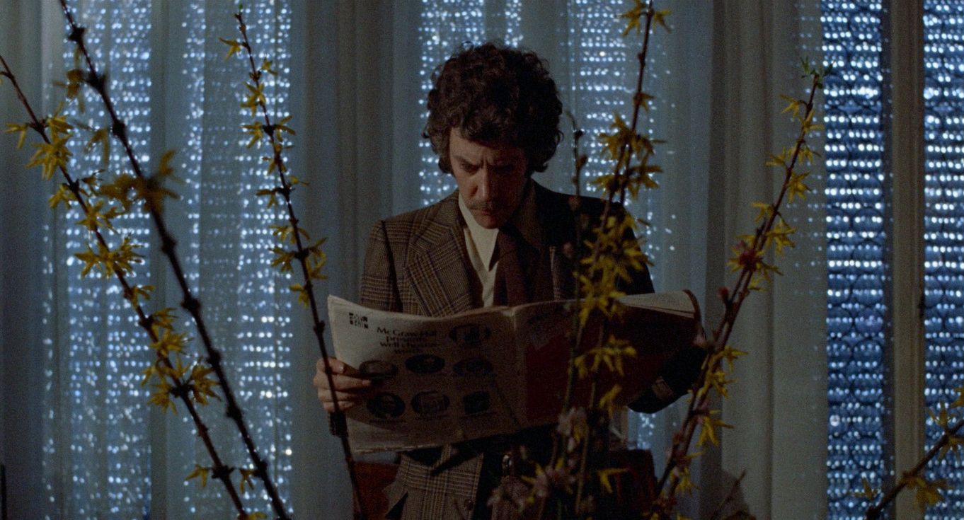
The Baxters are in Venice so that John can oversee the restoration of a church. This also places the pragmatic in conflict with the psychic, just as the material world cloaks the spiritual. The church is a building, an artefact, that Baxter is scientifically analysing and renovating. He’s only concerned with the aesthetic authenticity of art that was originally devotional and intended to represent something beyond its surface. Baxter has a window onto those mysteries, yet his analytical mind gets in the way.
What leads to his downfall is his unwillingness to accept his supernatural visions. Or could it be that if he accepts that there is ‘something more’, that would present a two-fold problem for him? Firstly, we know he had precognition of his daughter’s death but didn’t act quickly enough on his psychic hunch to save her. Secondly, if there is something more, that would suggest a spiritual realm, an afterlife, possibly a God that intentionally let his daughter die to test his faith… Either path would only lead him to further guilt and anguish. Yep, there sure are some pretty deep and profound themes running through this film.
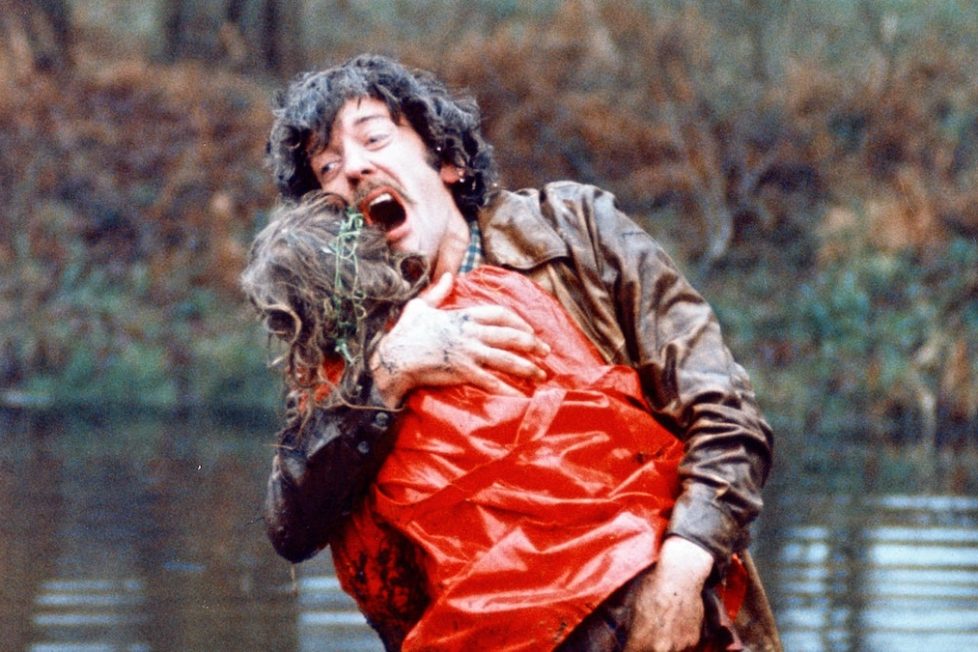
Periodically we see bodies being hauled out of the canals of Venice. Are these suicides reflecting Baxter’s possible state of mind, or is there something else going on? We soon learn there is a serial killer stalking the canals and mouldering backstreets of Venice. If this were a giallo, the murder plot would be much more to the fore but here it simmers away on a back-burner until finally coming to the boil for a most disturbing dénouement. The final scenes are truly terrifying and anyone who saw Don’t Look Now as a tender age, as I did, long regretted that they did look then! For a first-time viewer, it must still be one of the most unexpected and shocking images. Especially as it comes after such a steady and immersive slow-build of dread, masterfully handled by Roeg.
Perhaps it’s the Italian setting, or my own obsession with giallo, that puts me in mind of several techniques more often associated with the Italian pulp cinema of the time. Who knows, perhaps with filming in Italy during the ‘golden age’ of giallo, there was some cross-pollination. Don’t Look Now does sit comfortably alongside the early works of Dario Argento and its influence is palpable in his later supernatural films. A scene close to the finale of Phenomena (1985) quotes Don’t Look Now in both dialogue and structure as Jennifer Connelly approaches the snivelling child stood facing a wall, right up to the chilling reveal as the diminutive figure turns around and we see the face.

Though Roeg’s film is so distinctive that it doesn’t have any obvious forebears, one of the few films it most readily evokes is Luigi Bazzoni’s The Possessed (1965)—a proto-giallo and another sophisticated mystery thriller that makes good use of the creepy atmosphere of empty hotels and a desolate out of season ‘tourist’ town. The chase through the Venetian labyrinth and derelict palace also owes a debt to the finale of Mario Bava’s hugely influential Kill, Baby… Kill! (1965), there’s even a similar shot of a spiral staircase.
Nicolas Roeg was intrigued by the idea of using negative emotions, with grief at the forefront, as the main driver for his characters and how this could be treated in a way that is finally empowering, but not in some clichéd ‘happily ever after’ way. Because of this, it remains pretty grim fare and for an occult thriller, it tends to take itself unusually seriously.
It’s a long way from the high camp of Hammer’s heyday but takes the bleaker path that veered away from the gothic as part of a new wave of Brit horror typified by Witchfinder General (1968) and The Wicker Man. It marks itself apart from these examples by its innovative use of editing that weaves together threads from past, present, and future so cleverly.
Film is, at its very core, a time-based medium, and here Roeg is exploring the nature of time itself in both narrative and philosophical terms. The only other directors who have done so with anywhere near as much integrity would be Andrei Tarkovsky and David Lynch, and Roeg’s genius lies in keeping the narrative accessible for audiences beyond the arthouse. Don’t Look Now has stood the test of time and still works as a great genre-skirting mystery thriller.
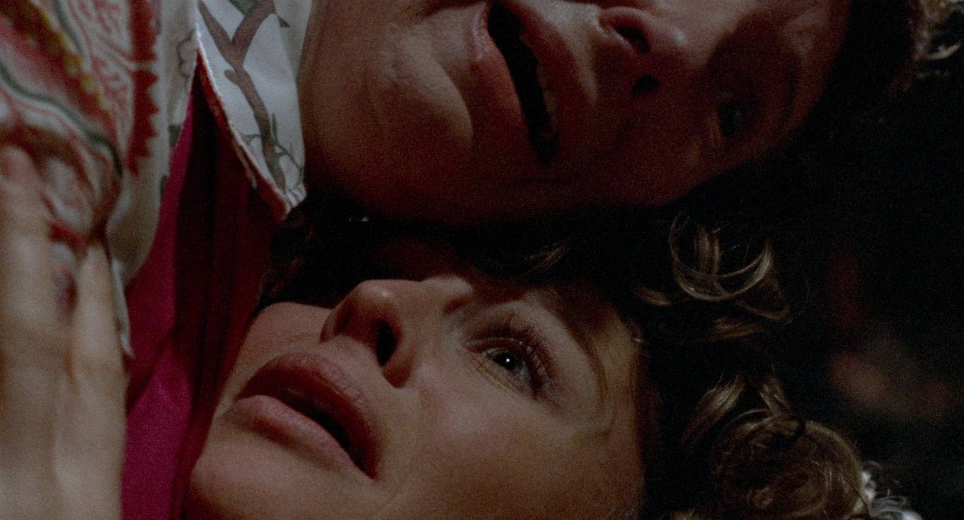
Upon release, it didn’t cause too much of a stir because there was a delay between its London premiere and finding general distribution in the UK, eventually as part of a double feature with The Wicker Man. The US release was more problematic because the now famous naturalistic sex scene between Sutherland and Christie, deemed at the time to be rather racy, resulted in an X certificate—which is the commercial kiss of death for mainstream films in the States. However, it was critically acclaimed, with generally positive reviews, and was nominated for seven major BAFTAs: ‘Best Film’, ‘Direction’, ‘Actor’, ‘Actress’, ‘Soundtrack’, ‘Editing’ and ‘Cinematography’—which was the only category it won.
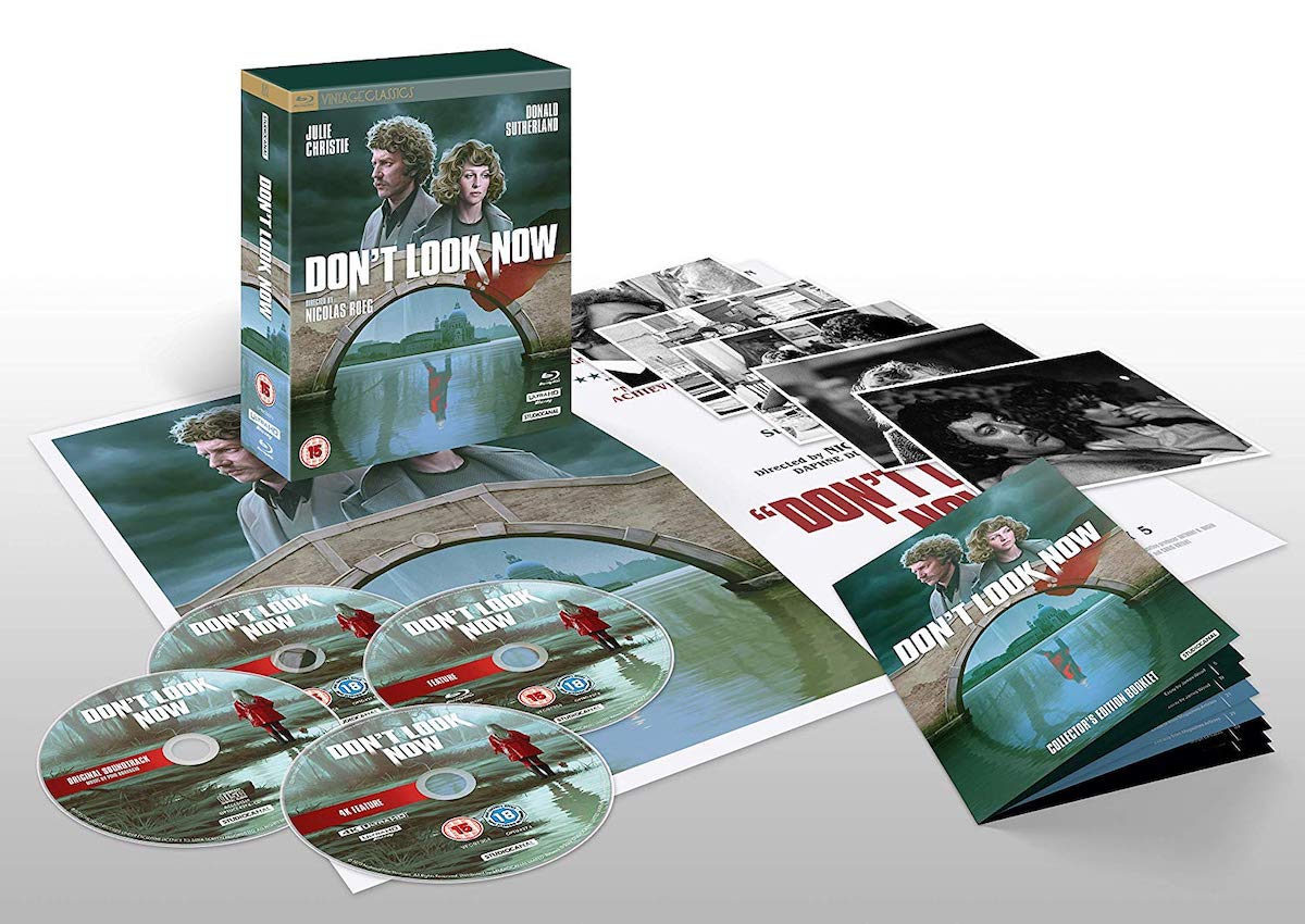
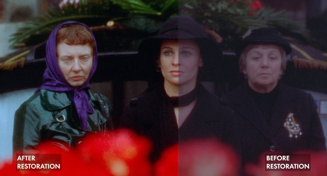
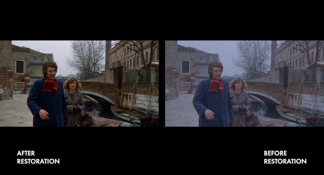
Over the decades it’s gathered a steadfast following of fans to become a cult classic. Directors such as David Cronenberg, Stephen Woolley, Martin McDonagh, and Danny Boyle are among those who quote it as a major influence. So, there’s certainly an audience eager for this handsome 4-disc collectors’ edition from StudioCanal’s Vintage Classics Collection, with a new 4K restoration supervised and approved by its award-winning cinematographer, Anthony Richmond.


director: Nicolas Roeg.
writers: Allan Scott & Chris Bryant (based on the short story by Daphne du Maurier).
starring: Julie Christie, Donald Sutherland, Hilary Mason, Clelia Matania, Massimo Serato & Renato Scarpa.